lördag 22 januari 2011
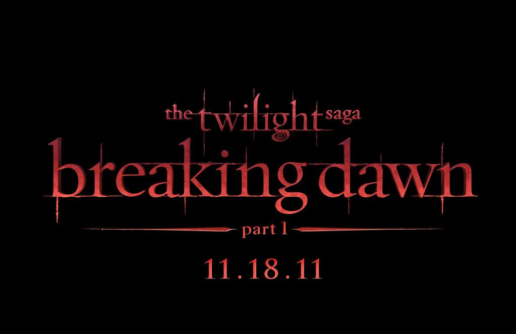
Does 'Breaking Dawn - Part 1' Title Card Reflect Movie's Tone?
In the spirit of the old adage "When it rains, it pours," a flurry of "Twilight" news and imagery has hit the Internet over the past two weeks. Things kicked off last week with the release of the first photo from "Breaking Dawn - Part 1," which showed the film's paramours, Robert Pattinson's Edward and Kristen Stewart's Bella, in a very romantic moment on the night after their wedding. Shortly after that photo set "Twilight" fan eyes popping and hearts racing, MTV News was lucky enough to catch up with Pattinson himself at the Golden Globe Awards to get his thoughts on the steamy-looking photo.
On Friday (January 21), Summit Entertainment released yet another early gift for the millions of "Twilight" fans, the official title card for the first part of "Breaking Dawn."
Keeping with the tradition and look of the first three films, "Twilight," "New Moon" and "Eclipse," this "Dawn" title card has the same font (its official name is Zephyr) that fans have come to know and love. And while the card for "Twilight" was red, "New Moon" was gold and "Eclipse" was shiny silver, this card for Part 1 of "Dawn" is a reddish orange — the color of, well, the sky as dawn breaks. According to Summit, each card has a unique color to reflect the tone of the story.
So judging from this intense color, what might we expect from the film that we don't already know about? Those who've read and obsessed over Stephenie Meyer's novels know that the conclusion to the "Twilight Saga" packed a punch, complete with a vampire transformation, a marriage, ababy and a battle.
Etiketter:
Breaking Dawn
Prenumerera på:
Kommentarer till inlägget (Atom)


Inga kommentarer:
Skicka en kommentar